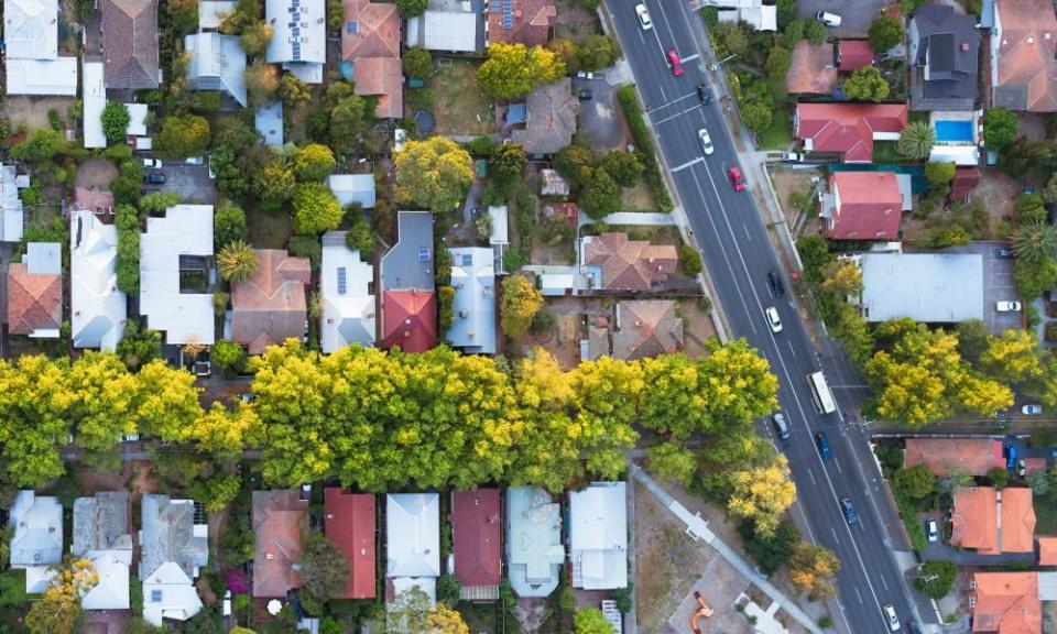
Disadvantaged areas of Melbourne hardest hit in Victoria's coronavirus outbreak

Analysis by Guardian Australia shows that Victoria’s coronavirus outbreak has had a far greater impact in disadvantaged areas of the city.
Areas with greater disadvantage within metropolitan Melbourne have higher rates of Covid-19 infections, and an analysis of the outbreak trajectory shows cases plateaued much earlier in better-off areas.
The analysis is based on a daily snapshot of the number of cases for each local government area (LGA), published on the Department of Health and Human Services’ dashboard map.
Related: Regional Victoria stage 3 coronavirus restrictions and lockdown rules explained
The Australian Bureau of Statistics’ Index of Relative Socio-economic Advantage and Disadvantage (Irsad) was used to sort areas into four groups, or quartiles, based on their Irsad score. The Irsad score summarises a range of information about the economic and social conditions of people and households within an area, including measurement of things like income, education levels, and employment.
For more details about how this analysis was carried out, see the notes below.
The results show outbreaks started later in areas with greater advantage scores (quartile 4):
The trajectories are also quite different between areas of greater and lesser disadvantage, with cases continuing to increase steeply in areas with greater disadvantage while quartiles 3 and 4 appear to plateau sooner.
More generally, areas with greater disadvantage have higher rates of Covid-19 infections:
Similar outcomes have been seen in the UK, where coronavirus death rates were higher in more deprived areas, and in Toronto, Canada, where case rates are higher in poorer areas, and lower in richer areas, with differing outbreak trajectories for richer and poorer areas.
Associate Prof Margo Barr is an epidemiologist at the University of New South Wales who provided advice on an earlier version of this analysis. Barr said the patterns were in part about access to services.
“When the disease first came to Australia, the majority were overseas returning travellers and so where you lived was not so much of a factor,” she said.
“This second wave is nearly all community transmission, and so where you live and what resources are available to you are important with regard to your exposure.”
Barr said relevant factors included whether people needed to work, used public transport and had access to hand sanitiser and masks; as well as their ability to transmit the disease to other people which was influenced by living in crowded houses, needing to work even when sick and not getting tested.
The Guardian Australia analysis raises the question – are government interventions working better for richer and less-disadvantaged areas and not as well for poorer and more-disadvantaged areas? Barr said that was not necessarily the case.
“I think it is more about what resources are available to the less-disadvantaged areas,” she said.
“It does, however, highlight that it is important to try and meet the needs of the individuals who get Covid-19 or have been exposed to it as well as their specific communities.
“For example in a high disadvantage area where there is more crowding, cases may need to be offered alternative accommodation or supplies when they cannot work, which may not need to occur in low disadvantage areas. Or masks and hand sanitiser may need to be provided by the local councils in high disadvantage areas which may not need to occur in low disadvantage areas.”
Notes and methods
Guardian Australia scraped the DHHS dashboard map daily from 7 April to produce a time series of cumulative cases by LGA, which was then converted into an approximate time series of new cases per day.
Case numbers can be retrospectively adjusted by DHHS for various reasons, which can result in negative new cases in some instances.
The ABS Index of Relative Socio-economic Disadvantage was assigned to each LGA within the metropolitan lockdown area, and metro LGAs were then sorted into quartiles based on their IRSAD.
The sum of cases per day for each quartile was calculated. This was divided by the total quartile population to produce a crude rate (cases per 100,000 population).
Related: Melbourne stage 4 restrictions and Covid lockdown rules explained
The crude rates were then age-standardised using indirect methods. Specifically by multiplying the crude rate by a correction factor (the number of cases in that quartile/expected number of cases in that quartile) to account for the different age profiles within each quartile.
The expected numbers were calculated summing each of the age-group specific rates for Victoria (accessed from the DHHS dashboard) multiplied by the age-group specific populations for each quartile (accessed from the ABS).
Thanks to Barr and Gideon Meyerowitz-Katz for feedback on the analysis. Any errors remain entirely the fault of Guardian Australia.

 Yahoo Finance