
 Yahoo Finance
Dulux reveals the colour we all need to embrace in 2022

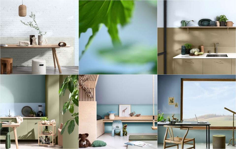
Bright Skies is the Dulux Colour of the Year for 2022. This airy, light blue signals a desire for a fresh start and a wave of hope and optimism.
Perfect for small spaces, brightening up a living room alcove, or used on the ceiling, the colour experts at Dulux describe Bright Skies as a true breath of fresh air and say decorating our homes with this colour will make us feel joyful, uplifted, optimistic and free.
'After a year of dreaming about being outside, turning our faces to the sun and planning our escape to anywhere but the local shops, we deserve a colour that is truly uplifting, optimistic and bursting with joy,' Marianne Shillingford, creative director of Dulux, exclusively tells House Beautiful UK.
'Dulux Colour of the Year always aims to capture the mood of the moment and the essence of what we want and need in our homes for the year ahead. This beautiful Alice in Wonderland of clear warm blues helps to reconnect us with a cloudless summer sky and all the freedom and possibilities nature has to offer.'
With millions of people now embracing hybrid home and office working, there is a need for colour to empower this multi-purpose lifestyle and the demands we put on our spaces.
'It is widely known that nature makes us feel better and taking steps to bring the outside in enhances our sense of wellbeing. So whether we are working or relaxing, creating or exercising, it is essential to have a space that reflects the optimism and desire for a fresh, new start that is top of the agenda for the year ahead,' Marianne adds.
Where to buy? Dulux Colour of the Year 2022 Bright Skies is available now in a specially designed unique can.
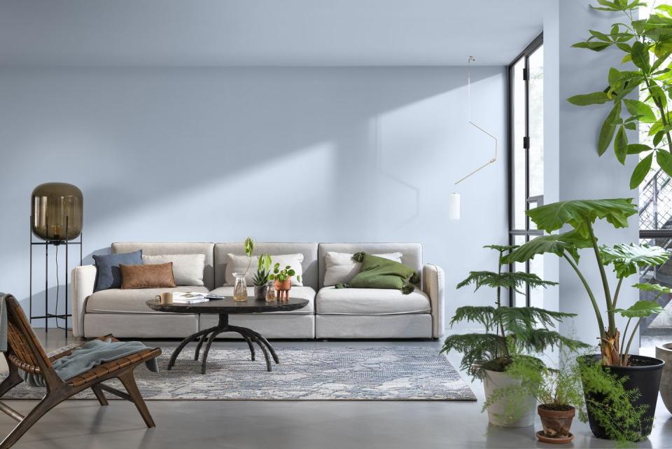
How to use Bright Skies to make your space look bigger
'Blue is a receding colour which means that it looks further away from us when it's on the walls. Using any blue in a room will make it feel more expansive but a pale clean sky blue, like Bright Skies, is the ultimate colour for melting the walls away and reconnecting with the biggest space of them all – the sky itself,' Marianne explains.
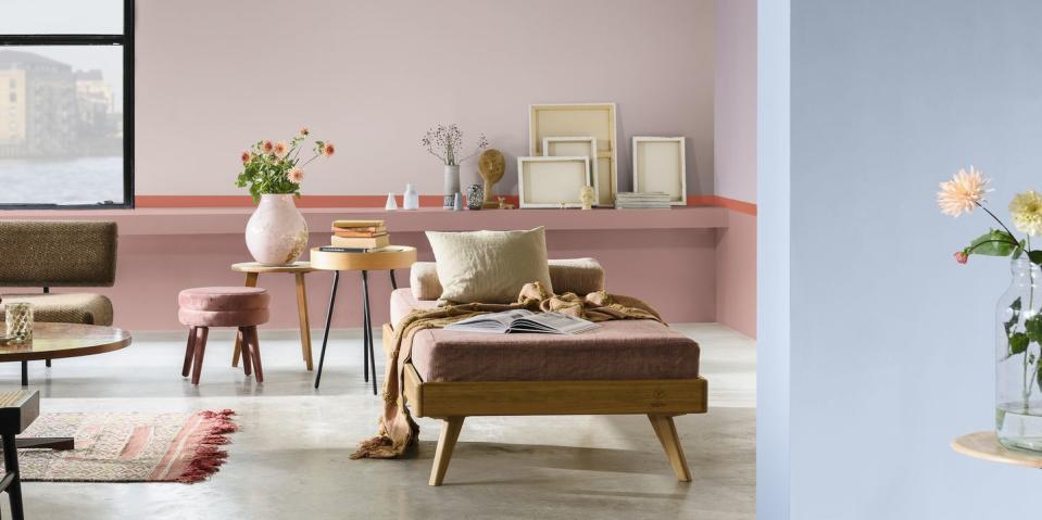
How to use Bright Skies in a living room
In a living room, use it in spaces where you would love to have had a window or simply more light. 'It's perfect for brightening up alcoves and on walls that you look at from your favourite chair or sofa and dream about summer holidays to come,' Marianne adds.
How to use Bright Skies in a bedroom
In a bedroom Marianne suggests wrapping this colour around you on all the walls, woodwork and doors, otherwise known as colour drenching, for a breezy look that puts a smile on your face first thing in the morning and last thing at night.
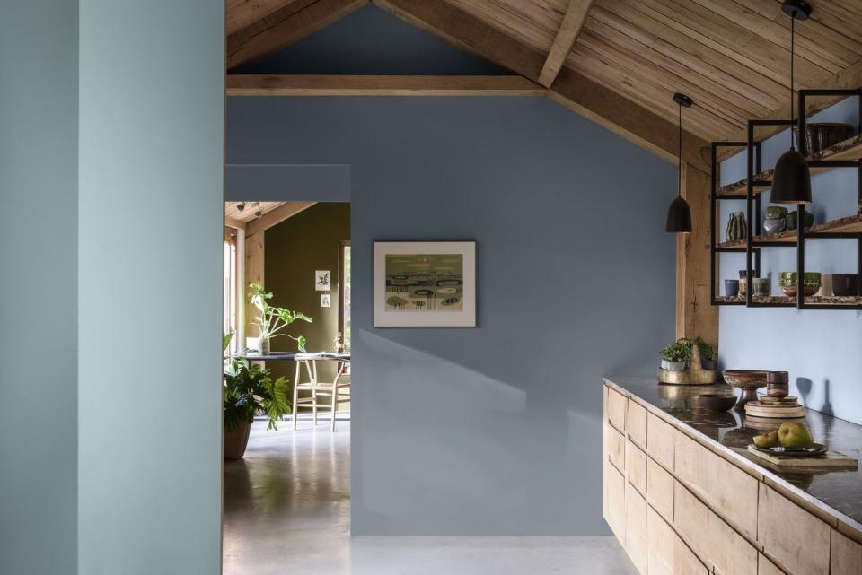
How to use Bright Skies in a hallway
Narrow hallway? 'Use it to make those pinch points and tight spaces look much bigger than they really are,' Marianne says.
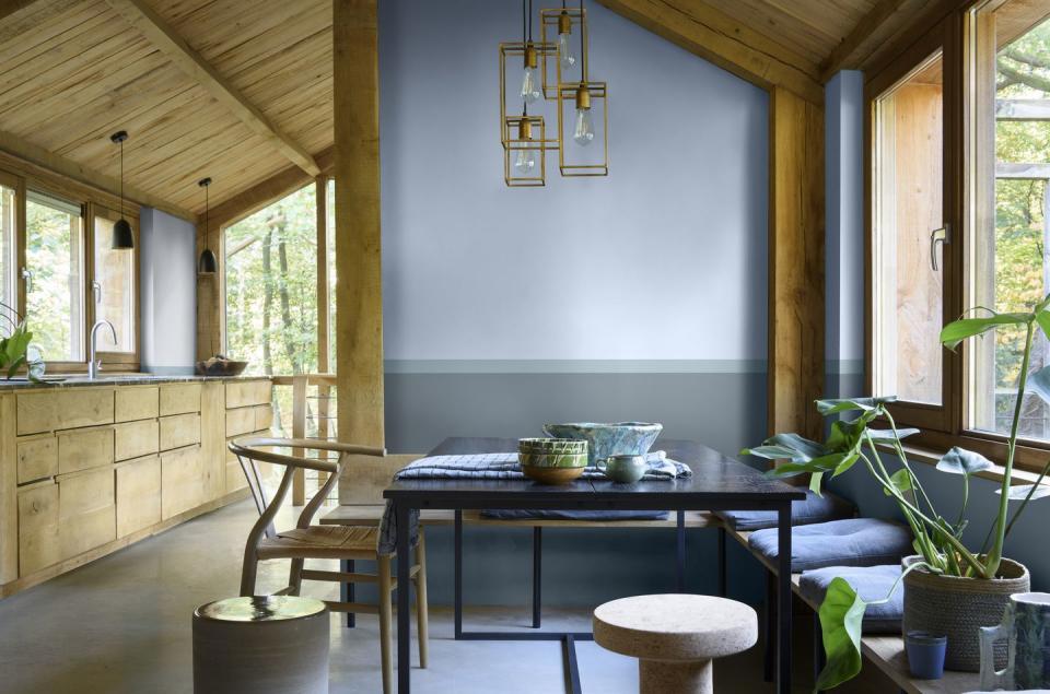
How to use Bright Skies in a home office
In a home office or dedicated workspace, use Bright Skies on the top third of the wall to keep you looking up when you are head down and hard at work.
The surprising place to use Bright Skies
Take a chance and use Bright Skies on the ceiling, aka the fifth wall. 'For all rooms in the house consider this colour for the ceiling where it has the magical effect of making it disappear and fills the room with an airy freshness,' Marianne says, who hails this technique as a 'complete game changer', especially for small spaces and low ceilings.
How to use Bright Skies more creatively
Use it in blocks or stripes and to create reading, relaxing and working zones to help you unlock the hidden potential of your home and feel less hemmed in by your four walls.
How to use Bright Skies without overpowering a room
'Use Bright Skies in hidden places like the edge of a door, in the window recesses and of course on the ceiling, where it will add a subtle dynamism without overpowering the space,' Marianne explains.
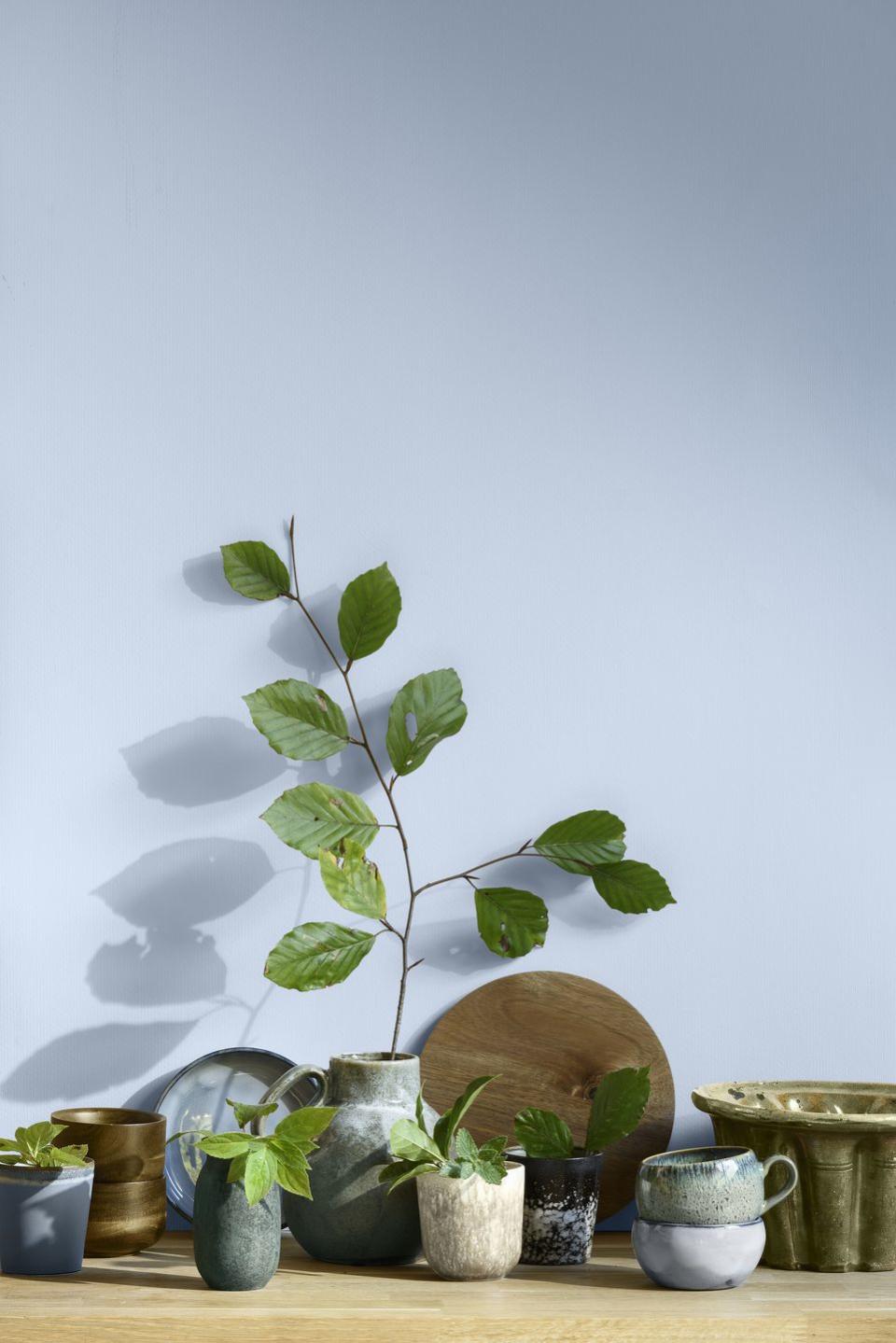
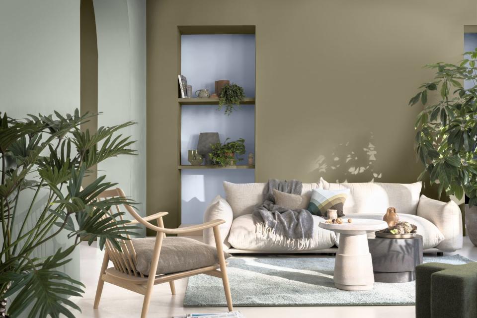
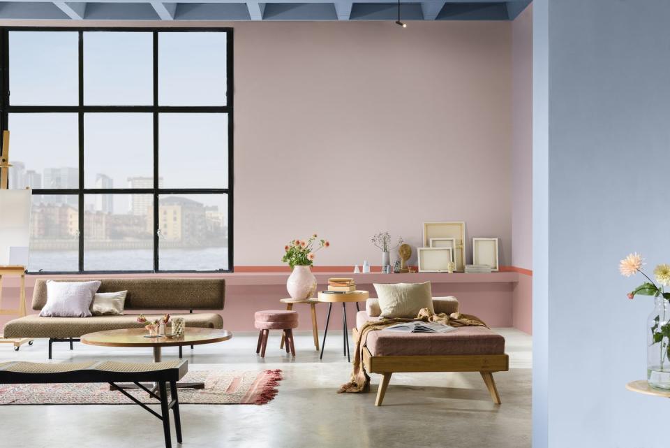
Wondering what colours you can pair with Bright Skies? To inspire decorating projects in every room of your home, Dulux have created four colour palettes – Greenhouse, Salon, Studio and Workshop – that complement Bright Skies. These colour palettes are designed to be used on the walls, as well as in accessories and furniture.
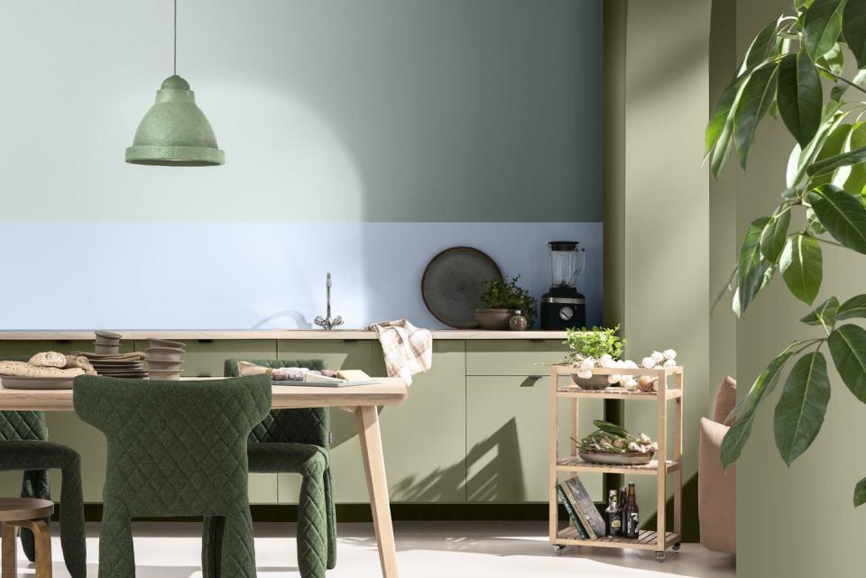
'Each has a distinctive personality and gives us something different to express in the rooms where we use them,' Marianne tells us. 'The Greenhouse palette invites nature in with a collection of colours that reflect the earth, sea and sky. The Workshop palette contains colours that help us zone spaces in hard working multifunctional homes, and the Studio palette offers us colours that gently celebrate our creative side. Finally, the Salon palette of subtle off-whites and neutrals provides the blank canvas on which we can be anyone and do anything.'
Heleen van Gent, head of the AkzoNobel Global Aesthetics Centre, comments: 'Over the past 19 years, we've seen a dramatic shift from a concentration on brighter tones to an emphasis on neutrals. This year, however, vibrant colours and light tones are re-emerging – a reflection, perhaps of our need for positivity and a fresh approach. After a spell of feeling shut in, we crave expansion – the great outdoors. The 37 curated colours in this year's collection help to make it easy to choose on-trend shades.'
If you don't fancy adding paint on your walls, Dulux has teamed up with several retailers to take Bright Skies beyond paint and into other elements of homes and interiors this year.
DFS has produced a range of soft furnishings in Bright Skies, including a sofa and complementary cushions in palette colours, and kitchen appliances manufacturer Stoves has created its Richmond Deluxe collection of range cookers in Bright Skies as a centrepiece to a modern kitchen. There are also two types of Bright Skies tiles by Topps Tiles to encourage different transformation projects around the home.
Follow House Beautiful on Instagram.
You Might Also Like
