Six car manufacturers that have updated their logo for the digital age
Choosing a company logo is a difficult task. Trends come and go, and designers must come up with timeless designs that can be fitted to cars spanning multiple generations, while also portraying the correct brand identity.
However, sometimes outside factors encourage change. In recent years, flat design has become the most prominent design trend, because complicated logos with shadows, gradients and detailed features don’t look good on screens.
In the digital age, though, that simply won’t do. And with the car industry experiencing a massive shift towards electric vehicles, switching your logo is a great way of not only modernising your brand, but also making a statement about your new brand identity.
Here are some car manufacturers that have updated their logos in recent years.
Kia
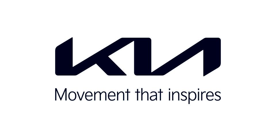
Kia has been on an upward trend over the past decade or so. While it’s still best-known for providing affordable mainstream models, there’s been a definite switch to building more stylish, premium models.
The new logo “represents the company’s commitment to becoming an icon for change and innovation,” according to Ho-sung Song, Kia’s president and CEO.
He added: “Our new logo represents our desire to inspire customers as their mobility needs evolve, and for our employees to rise to the challenges we face in a fast-changing industry.”
Volkswagen
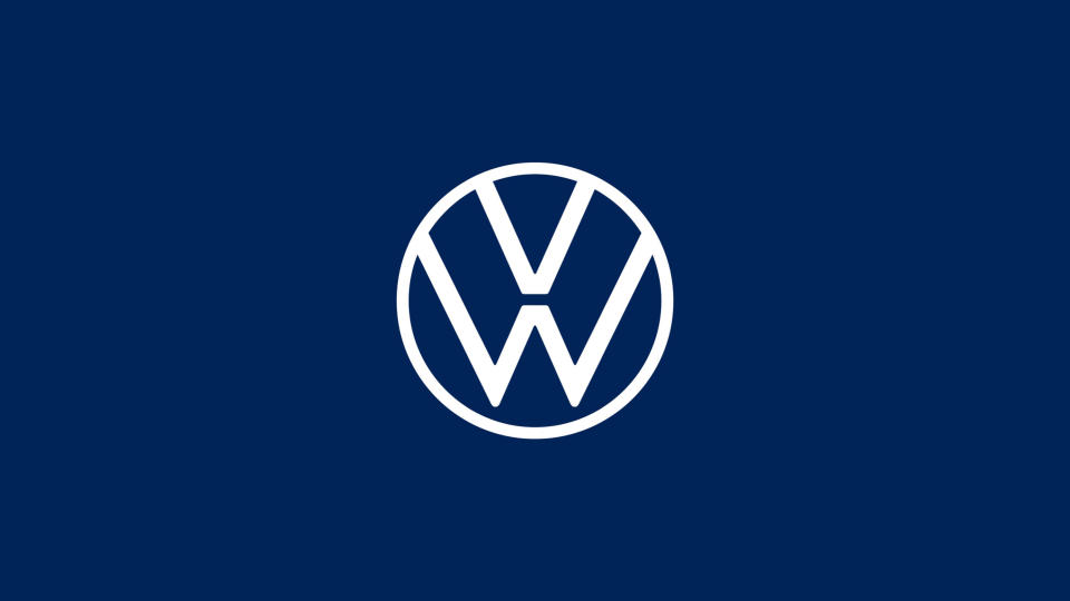
One of the most prominent logo changes in recent years came from Volkswagen. The automotive giant changed from the 3D-effect logo that’s known the world over, to a much simpler interpretation of the same design with a new dark blue colour scheme.
The move has come at a time when VW is pivoting its business towards building electric models for the mainstream market, and said the new logo marks the ‘start of a new era’.
BMW
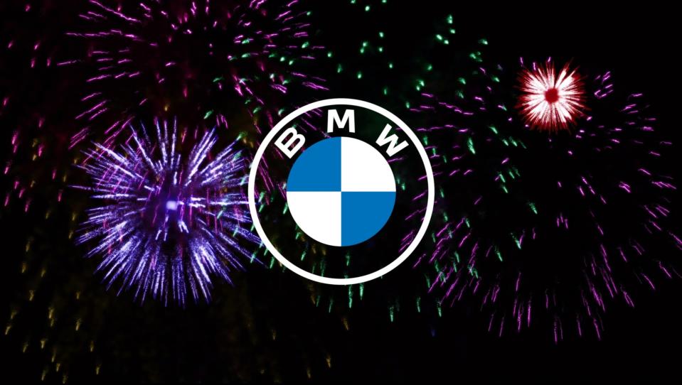
Another major German manufacturer to go for the 2D approach was BMW, which saw its traditional roundel reinterpreted with a transparent surround and new font for the digital era.
It plans to continue using the traditional logo on its cars, for the time being at least, using the new logo for communications. The idea is that it looks good on social media and websites, as well as future-proofing for use in apps and other digital products.
Nissan
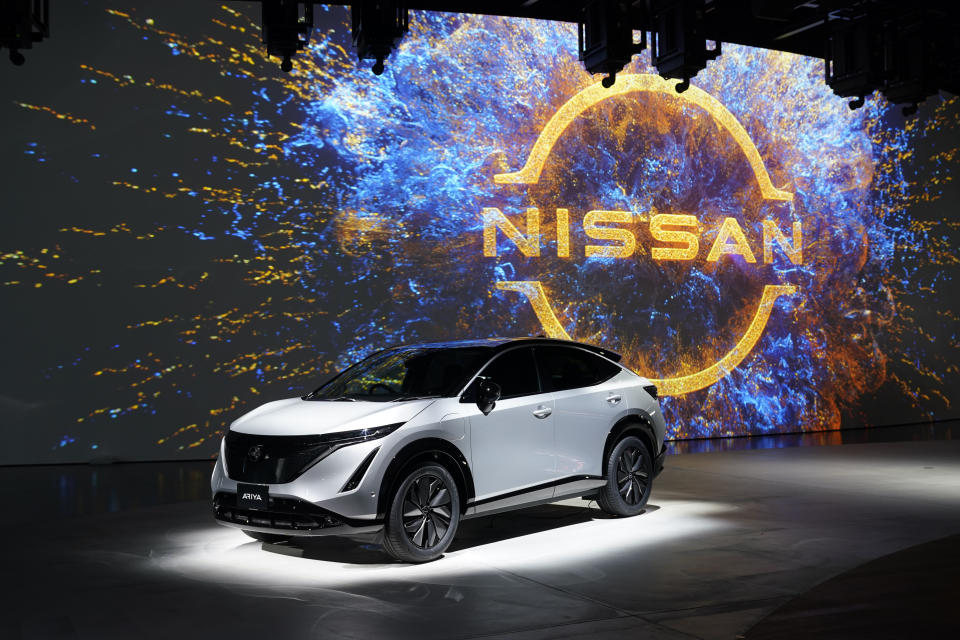
Japanese car maker Nissan took its chrome-effect logo and simplified it this year, keeping the same principle of having the company name centrally located within a circle.
The raised block in the middle is gone, but its spirit remains thanks to two flicks on the end of each line that represents the border. The brand overhaul was intended to make the logo more ‘digital-friendly’.
Audi
Audi was ahead of the trend when it came to flat design, switching its logo up in 2017. The four overlapping rings are an iconic logo, designed to look like metal or chrome.
Little has changed for the new look, with the same four rings now simply losing their 3D effect. Interestingly, Audi used to have a 2D logo, so has returned to its roots.
Peugeot
No, this isn’t the logo from a fictional football team, it’s Peugeot’s new logo. The French firm has been moving its products upmarket in the last few years, and with the electric revolution coming, it has seen this as the ideal time for a rebrand.
It has a clean shield shape surrounding a modern version of the iconic lion symbol, with the Peugeot name across the top. It has some suitably pretentious design-speak to go with it, as it was ‘developed around the concept of ‘time’ and living in the moment’.

 Yahoo Finance