
 Yahoo Finance
 A legendary Italian designer designed his own funeral, and he didn’t miss a detail
Most funerals are modest, hastily planned events left to mourning family members to put together. But for design legend Massimo Vignelli, who passed away two years ago today (May 27), it was a farewell that he personally designed down to the last detail, capping a long, storied life in design.
For many years, Vignelli developed the vision for his funeral—his final design production—carefully choosing the location, the program, the music, the speakers, the guest list, and of course, an impeccable custom-made crematory urn.
“Conversation with him about his funeral was a recurrent theme,” says Beatriz Cifuentes-Caballero who, together with her husband Yoshiki Waterhouse, were the executors of Vignelli’s design will. “He was never afraid of talking about it, even taking pleasure in knowing that his memorial would be his last gift to his friends.”
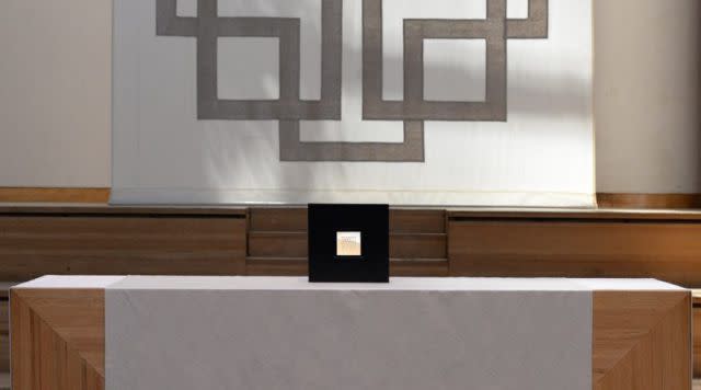
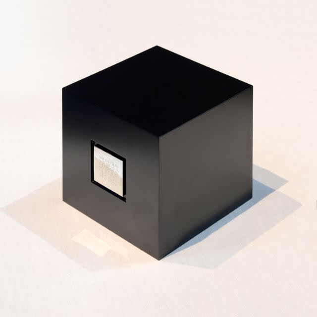
John Madere, who made a short film about Vignelli in 2010, was the only professional photographer allowed at the private service. He says the perfectly orchestrated event was a tribute to Massimo’s meticulousness that he witnessed while filming at Vignelli’s studio. “It was the only such service that I have seen where the deceased had so artfully and carefully planned every tiny detail of his own memorial,” says Madere. “At the center of it all was a small, perfect black cube designed by Massimo to contain his ashes—a perfect representation of his penchant for simple, beautiful design.”

A staunch modernist who introduced American designers to orderly grid systems and held a fondness for the rational typeface Helvetica, Vignelli is best remembered for translating the “spaghetti tangle” of the New York City subway system to an intelligible map.
Born in Milan, Vignelli and his wife Lella built a thriving design practice in New York City garnering high-profile commissions from clients such as IBM, Bloomingdale’s, and American Airlines. Vignelli was also a teacher for a generation of graphic designers, many of whom sent heartfelt handwritten letters as his health began deteriorating in May 2014. He was 83 years old when he died.
A church he designed
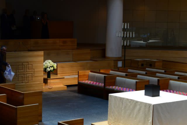
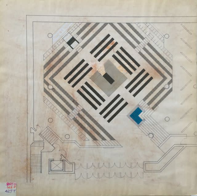
Vignelli knew exactly where he wanted to be buried: Saint Peter’s Lutheran Church in midtown Manhattan. He and Lella had designed the interiors of the modern architectural marvel in 1977, and even created the furnishings, liturgical objects and graphics. He also knew exactly how the space should be arranged, remembers Cifuentes-Caballero:
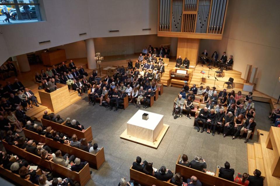
Massimo pictured a “central arrangement”, in which his urn would be placed at the center with everybody surrounding him (all in black of course). The church’s beautiful organ, whose case he also designed, would be playing. He also provided us with a list of speakers, as well as a rough guest list. He often remarked how much he would love to be there to see it.
He always imagined his funeral to be grand but austere, an almost theatrical event in which all his friends could come together and celebrate his life and extraordinary career. We would be working together in the office listening to music, when a piece by Bach would sound and Massimo would shout with joy out of nowhere: “ I want this piece to play at my funeral!”
I would quietly jot it down.
On July 23, 2014, Cifuentes-Caballero and Waterhouse, both longtime Vignelli Associates employees, eventually realized Vignelli’s vision for his memorial service.
The tale of two urns
Vignelli had two custom crematory urns. One was inscribed in Optima, the other in Helvetica.
“Some years earlier, Massimo had designed an urn for his mother’s ashes, and modeled his own to match,” says Cifuentes-Caballero. “It was a black lacquered wooden cube with a recessed engraved square silver plaque at the center of one face. The exterior of the cube had no seams or screws, and we spent a long time together making sure the details were flawless. The cube was built in Italy by Piere Luigi Ghianda, a master craftsman and friend of the Vignellis.”


Known for his clear-minded, practical solutions, Vignelli was not one to fuss over long catalogues of font choices. He had a few standby typefaces which he knew how to use strategically. In the 2007 film Helvetica, Vignelli explained that good typography is about the deft manipulation of space, not just letterforms.
Says Cifuentes-Caballero:
Massimo had designed the Saint Peter’s graphic program in Optima, an elegant typeface appropriate for church graphics. However, he was well known for his use of Helvetica, which presented a typographic dilemma for him when planning the columbarium. In the end, he was willing to live for eternity with Optima instead of his beloved Helvetica to preserve the integrity of the church’s graphic program.
But in preparing for the funeral, Cifuentes-Caballero and Waterhouse realized that Vignell’s carefully specified cremation urn was too big for Saint Peter’s columbarium size specifications. They quickly had a smaller cube made based on this drawings, adding one special detail.
The new cube gave us a chance to give Massimo his Helvetica back. We designed a new silver plaque with an inscription in a single-line version of Helvetica that we made for the purpose. So the stone plate of the columbarium is in Optima, but the urn inscription within is in Helvetica. He would have been so relieved with that compromise!
Warm, humble, and affable in person, Vignelli is missed by those who knew him personally and still widely quoted by young designers learning about his design philosophy. As his protégé Pentagram partner Michael Bierut wrote in Design Observer, “I learned to think of graphic design as a way to create an experience, an experience that was not limited to two dimensions or to a momentary impression. It was about creating something lasting, even timeless.”
A patron saint of clarity, order, and rational beauty, Vignelli’s influence goes beyond the grave.

Sign up for the Quartz Daily Brief, our free daily newsletter with the world’s most important and interesting news.
More stories from Quartz:
