
 Yahoo Finance
 Pantone hopes its color of the year will improve our gloomy mood
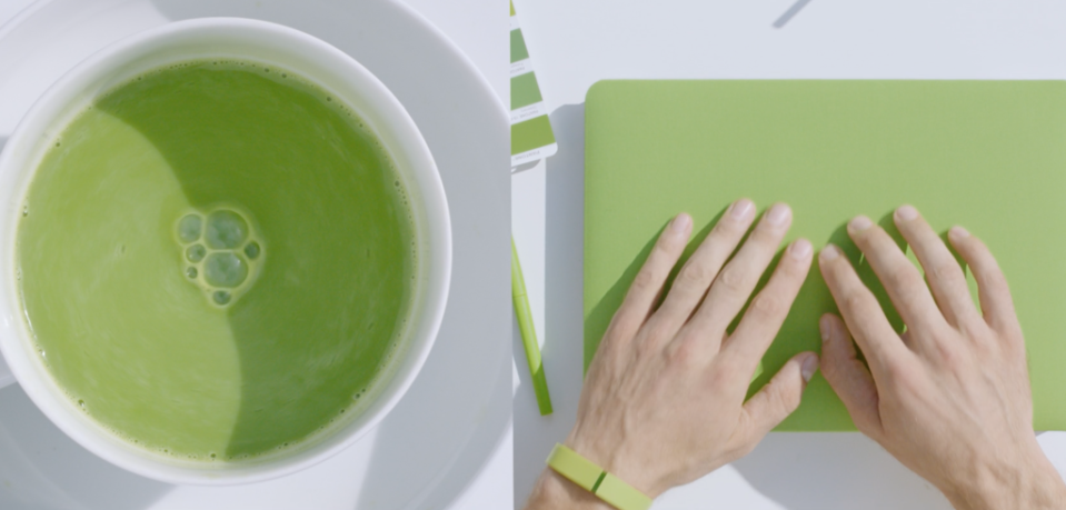
The time has come to put away 2016’s pink and blue. Pantone announced today (Dec. 8), that it has chosen a “tangy yellow-green” shade called “Greenery” as the color of the year for 2017.
The mythic color standards company says it selected the bright, natural color as a counterpoint to the dark malaise caused by the murky political climate around the world. “Greenery bursts forth in 2017 to provide us with the hope we collectively yearn for amid a complex social and political landscape,” explains Leatrice Eiseman, executive director of the Pantone’s color consulting arm. “Greenery symbolizes the reconnection we seek with nature, one another and a larger purpose.”

Color of the year.
With Pantone’s global popularity and savvy industry partnerships, expect a surge of Greenery—Pantone 15-0343, to be exact—everywhere. Now on its 17th year, Pantone’s color of the year is closely watched by designers and strategists as it directly influences product development in multiple industries—from fashion to interior design and branding. The cosmetics brand butter LONDON has already created an official Pantone Greenery nail polish and eye make-up in the zesty shade that evokes spring’s saplings, Granny Smith apples, fresh cut grass and, inevitably, Kermit the Frog.
Greenery reflects the emergence of biophilia in office design. A recent global study by research firm Human Spaces suggested a 15% boost in employee creativity and well-being and 6% increase in productivity when work spaces are infused with natural elements such as greenery and sunlight.
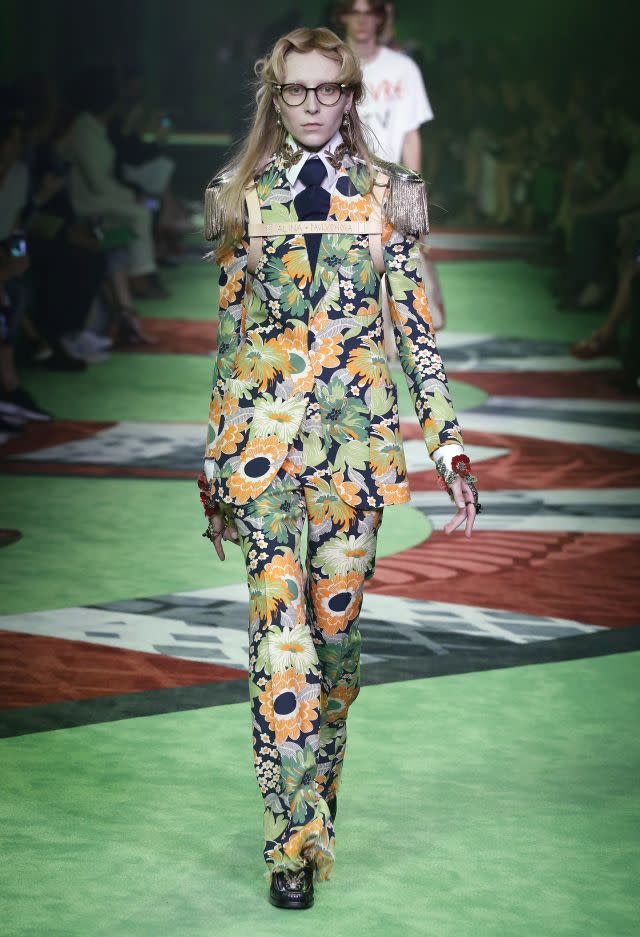
Gucci, Spring/Summer 2017.
Every year, Pantone gathers a “secret cabal” of trend watchers to choose the color of the year. The group surveys trends in film, art, sports, fashion, all areas of design, and politics. In an interview at its New Jersey factory last year, Pantone’s Laurie Pressman explained that the company aspires to hone in on a particular shade that mirrors or serves as an antidote to the zeitgeist. The first color of the year, 2000’s Cerulean blue, was chosen to allay the angst associated with Y2K. Last year’s twin colors, Rose Quartz and Serenity, were a nod to gender equality.

Sign up for the Quartz Daily Brief, our free daily newsletter with the world’s most important and interesting news.
More stories from Quartz:
